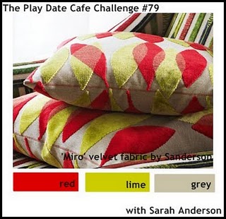
As I had just received new stamps from the March layering challenge at Hero Arts, I thought I would try some easy designs for the PDCC challenge this week with the colors of red, lime and grey.

These are not easy colors and definitely not my go-to colors but I love a little challenge.

I love this Simple Frame stamp from Hero Arts, I have lots of ideas with this one. Another Hero arts stamp on this one is the Silhouette Spray and the humming bird from the clear set called Antique Engravings.
These are both stunning, Not your usual style but you do CAS so beautifully. I love them both.
ReplyDeleteTake it easy, hugs Sally.
Beautiful cards, Jaqueline! Love that frame too! Take good care.
ReplyDeleteHugs, Petra
Laying in bed resting is exactly what you should be doing right now, my friend! Love what you did with these colors; I agree, they are not easy ones! Sending hugs.....
ReplyDeleteSo glad you are taking time to rest Jacqueline! I love what you did on both these cards with these colours! Stunning work! You are right, they are not easy colours and I would have great difficulty using them, but they actually look fantastic when stamped with images with thin lines if you know what I mean, instead of solid stamps! And with all the white space you left, it's perfect!
ReplyDeleteAs per usual....GORGEOUS cards Jacqueline!!! I am always a fan!! LOVE how you used more white space this time...not your usual right? Hope you continue to take it easy! Thanks so much for joining us at The Play Date Cafe...please come again!! Hugs, TRace
ReplyDeleteI agree that these colors are a bit difficult, but you've used them beautifully, Jacqueline! Keep resting and healing. . . .sending more hugs!
ReplyDeleteThese are both very tender cards, love the stamps you used and the colours are used in such a serene way. Take care, Ira
ReplyDeleteJacqueline, your cards are BOTH fantastic! I actually love all the white space...these colors are bold and they look so clean and classy on your card!
ReplyDeleteSo much feeling in these cards ... they're beautiful! You handled these colours so well ... I agree with you, they're not easy colours to use. I wouldn't know what ink to use for the lime green! Jacqueline, you and your family continue to be in my prayers. Let yourself get lots of rest and sleep so your body can heal. Sending you hugs!
ReplyDeleteI feel the same way about these colors...definitely not my go-tos...but fun every once in a while! Especially when you find a design that works, and apparently you have! Both cards are equally elegant and classy...love those stamps you used! Great job! So glad to have you playing along with us at the Play Date Cafe!
ReplyDeleteBoth cards are beautiful, Jacqueline
ReplyDeletebeautiful cards Jacqueline. Glad you are taking things easy. Keep well.
ReplyDeleteThese are soooo beautiful!! I just keep looking and looking at them!
ReplyDeleteThinking of you a lot this weekend and lifting you up in prayer! Our God is good!!!!
These are so beautiful ... I seem to be having difficulty leaving comments ... it only works when I do a previous post ... so your latest cards are gorgeous ... lovely frame ... sending you happy thoughts and best wishes ... God Bless
ReplyDeleteI am in love with both of these cards, Jacqueline! The soft style speaks to my heart. Thanks for making time to play with us at The Play Date CAfe.
ReplyDeleteI love how you've made the colours look so soft and delicate yet still followed our colour palette, really lovely cards! Thanks for playing along with us at Play Date Cafe!
ReplyDeleteI love both card and would never know that you don't use these colors. I like that you used that frame to create little scenes. Thanks so much for playing along at The Play Date Cafe.
ReplyDeleteGorgeous use of the colors. Both cards are beautiful! Love the flowers and touches of red!
ReplyDelete